Understanding Colour Psychology in Education Design
Dr Ulrich Beer writes in his book, ‘What Colour Tells Us’, “No one can encounter it and stay neutral. We are immediately, instinctively, and emotionally moved. We have sympathy and apathy, pleasure or disapproval within us as soon as we perceive colour”
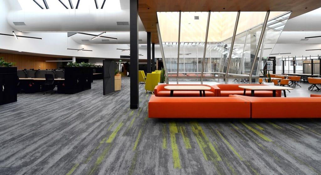
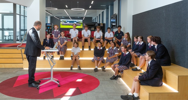
Designer: H2O Architects Project: Deakin University Products used: Fusion carpet planks
The physical environment has an enormous impact on teaching practices and student outcomes. So, when it comes to elements in the built world that influence user behaviour, morale and performance – the importance of colour psychology can hardly be debated. Sure, colours have decorative appeal, but beyond that – their presence ties closely with elements of wellbeing. In fact, the right colours have the potential to protect eyesight and create spaces that are conducive to study. Thus, promoting physical and mental health. Without the right balance, you’re sure to be looking at issues like fatigue, irritability and lack of interest.
Designer: Spowers Project: Macquarie University Products used: Pure Planks
The research
- A study on the ‘Impact of Classroom Design on Pupils’ Learning’ notes that ‘the school’s design had a 16% impact on students’ learning rates.’ It factors in seven key design parameters like light, temperature, air quality, flexibility, ownership and colour.
- A paper titled ‘The Inclusive Classroom: The Effects of Colour on Learning and Behaviour’ finds, “Responses to colour are both scientific (physiological) and emotional (psychological).
- Studies (Engelbrecht, 2003; Morton, 1998) related to colour’s physiological effects have shown changes in blood pressure, eye strain, and brain development. For example, exposure to red causes the heart to beat faster and increase blood pressure. In contrast, blue causes a slower pulse rate, lower body temperature, and reduced appetite (Engelbrecht, 2003).”
- In another study, researchers Sinofsky and Knirck (1981) have found that colour choice also impacts the teacher-learning process or the degree to which students absorb information. This is because colour affects a student’s attention spent, further affecting a student and teacher’s sense of time.
Raw Elements for learning environments
What do students need?
In their early learning years from 0-12, children have lengthening memories and typically learn and process information quickly. Since colour is one of the most noticeable attributes in the spaces around them, it emerges as a significant component in influencing the design of educational environments.
For adolescents, 12-18 years is a time of identification, as it ties very closely to the development of their character and personality. Using colour psychology in design is then a way to support specific feelings and behaviours essential for quality education. Research points to the popularity of bright colours and contrasting combinations for ages 12-16. For older teenagers, harmonious combinations are usually more welcoming.
For students between the ages of 18-25 in higher education, needs and preferences vary widely from adolescents. The study aspect of education is vital to this group, as are elements of leisure and recreation. With higher education spaces noticeably different from secondary school classrooms, considering colours and design accordingly is key. Areas need to be comfortable to earn these students’ focus to help them make the most of their education.
Using colours, the right way
- Approaching colour choices in education spaces goes beyond aesthetics. It needs to be considered in terms of goals like improved attention spans, more productivity, less eye fatigue, etc.
- A critical step is then factoring in learner age, size of space, colour balance, and the subjects being taught. For example, an educational area for an engineering student could be widely different to that of an arts and humanities student.
- A deeper understanding of warm and cool colour palettes and how they work – is also crucial to creating successful colour combinations. A study by Bross and Jackson (1981) found that well-liked school colours influenced muscle tension and motor control skills. Children were less likely to make errors while working in a cubicle painted with their favourite colours.
In a 3-year study by Dr Henner Ertel and his colleagues from the Institute for Rational Psychology in Munich, the researchers noted that a random sample of 473 students – using well-liked colours raised the average IQ by 12 points. Rooms were typically painted light blue, yellow, yellow-green or orange. These are all colours the children deemed ‘beautiful.’ In contrast, rooms painted with ‘ugly’ colours like black, brown and white caused IQ levels to drop by 14 points for children who played in them.
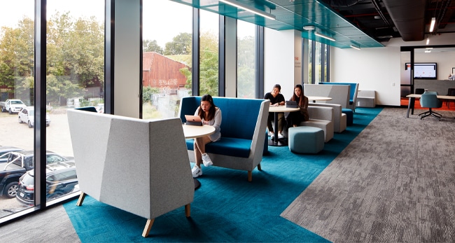
Photo: Luc Remond Designer: Gray Puksand Project: William Angliss Institute of TAFE Products used: Groove & Vivid carpet tiles
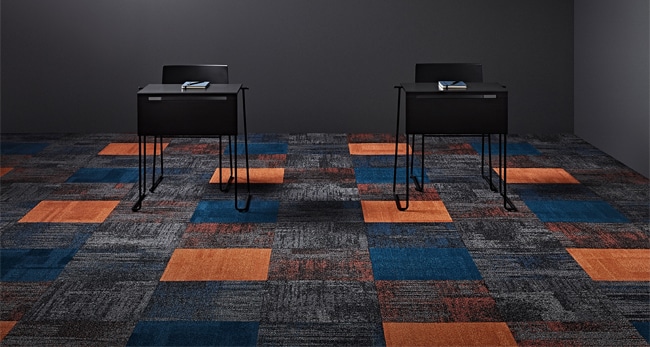
Popular colour choices (non-exhaustive)
Past and recent studies have concluded that lighter colours support learning better compared to darker ones.
- Welcoming hues that say, ‘come on in’ include bright orange, yellow and green! Orange is a mood-lifter for learners and promotes comfort and neural functioning.
- To create an environment of calm and harmony – blue is an excellent choice.
- On the other hand, green is a great way to emulate nature’s elements like trees, flowers, and plants. The colour also promotes concentration and clarity.
- Shades of brown help reduce feelings of fatigue, making students feel more secure and relaxed.
The other key component in the colour psychology conversation is thinking of colour quantity. Too many stimuli can be a deterrent in the learning process, causing students to feel stressed when mentally organising visual information. High contrasts, for instance, tend to overstimulate, while monotonous colour schemes will under-stimulate. Ultimately balance is vital.
How does colour psychology impact flooring choices?
Since flooring is one of the largest surface areas in any educational establishment – it has an enormous impact in defining the look and feel of a space. But there’s more. Flooring can also help reduce sound, enable safe movement and help students and staff transition to and from a room with a sense of ease and comfort.
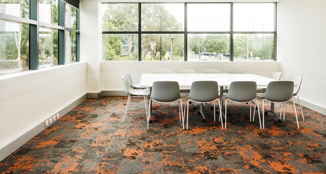
Designer Cirillo Architects Project: Emmanuel College, Warnambool Products used: Vivid carpet tiles
What are your options?
Carpet tiles feel soft and comforting, transforming hard spaces into flexible learning zones. With an extensive stocked colour offering like the Signature Vivid 202 range, designers can choose from 5 hues in 36 tints, tones and shades. Plus, neutrals in a range of 22 achromatic tones. With our Comfi Bak cushion backing, these modular floor coverings reduce muscle fatigue for educators who spend most of the day on their feet. These industrial-grade carpet squares and planks are also excellent from a sound mitigation perspective. Thus, making them ideal for installing within classroom environments.
Coloured vinyl plank flooring, on the other hand, is suitable in transition spaces and hallways. The 88 Planks Colour 5.0 range provides a choice of 24 plank colours. Alternatively, woven vinyl floor tiles are sought after for combining textile’s warmth with vinyl planks’ strength. Available in a range of 26 colours, it’s a favourite in education flooring projects.
Flooring choices for education
From muted natural textures and colours that create areas for focused studies to bright colours that stimulate productivity – there’s a wide variety of commercial flooring options to pick and choose from.
Photo: Gallant Lee Designer: Borg Architects Project: IDP, Melbourne Products used: Shapes RA Triangle – Shift Carpet Tiles
Combining colour with shapes
It’s also easy to combine colour with shapes courtesy of the 10 Shapes by Signature program. For instance, warm, neutral shades that suggest comfort or safety could pair well with square tiles or rectangular planks. If bright or bold is the colour scheme you’re leaning towards for productivity and creative thinking – it makes sense to combine them with shapes like triangles.
Ultimately, a student spends most of his/her time in their place of education. It’s where they learn the skills they need to succeed in a global community. Further shaping their futures are the experiences gathered here. And so, it matters that these spaces are moulded to create the most conducive outcomes.